Thursday, September 29, 2011

Thinking of You Vintage


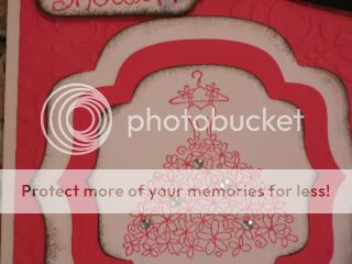
For this card I wanted to try to make a card with a bit more of a vintage feel. This is not my typical style but I wanted to try somethng different. Let me know what you think. The paper colors are SU Chocolate Chip, Kraft, and Pear Pizzaz. The image & sentiment are stamped with Early Espresso and the edges inked & the embossing highlighted in Chocolate Chip. I distrssed all of the edges except the card base. The embossing folder is Vintage Wallpaper (one of the must haves in my opinion). The "ribbon" is Pear Pizzaz seam binding. I made the gathers using the technique where you pull a thread on one end & gather the binding by pushing it down the single thread. I also used some bling with the Basic Rhinestones. The corner brads are some retired chocolate chip ones.. you could substitute many other ones for this. I also used the new Dazzling Details SU glitter glue that is in the holiday mini on the pear & the kraft accent around the sentiment. I am so excited SU has this it is just like the Dazzling Diamonds glitter!! There is also some retired chocolate chip felt ribbon under the seam binding. I'm not sure why the cardstock looks a bit lighter than the seam binding in the picture...in real life they look the same.

Monday, September 5, 2011

Klay's Banner


I made this for a friend of mine who just started her own business. I visited first to check out the colors they used and I came pretty close. This is Rich Razzleberry & Mellow Moss (retired). I used the Cricut Country Life cartridge to cut the banners. Flowers were from my stash.

Wedding Place Cards


Here are the place cards for the wedding. The colors again are Melon Mambo & Night of Navy. I used the Stampin' Up! Top Note die. The white smaller layer I cut around the dotted edge to get the layer.

Sunday, September 4, 2011

More Pre School Pics


For this layout I used Stampin' Up! Brilliant Blue (retired) & Real Red. I also used the Elegant Edges Cricut cart for all of the mats. I must say I love, love this cartridge! All of the little circles I added are from the centers that were left on my cutting mat. A few chipboard accents that I have had for many, many years finally put to use. I learned a few things with my photo editing on Photo Bucket, too!

Pre-School Layout


On this layout I wanted to use the photo mat the photographer gave us with the pictres as it sat on my son's dresser for a long time. Colors are Stampin' Up! Brillint Blue (retired) & Going Gray. I used a MS border punch & some MME journaling spots, SU Brilliant Blue 1/4" ribbon, inked all the edges in Brilliant Blue, the lettering is SU Varsity Letter Alphabet letters cut stamped in Brilliant Blue ink on the gray paper.

Thursday, September 1, 2011

Wedding Reception Invites


After the bridal shower invites were done we needed invites for the wedding reception. I think there were about 75 of both invites made = 150 total in just a couple of weeks. This is melon mambo, night of navy, and silver vellum from a big box store, Stampin' Up! punch for the flowers & some bling from the LSS, the embossed cake is a Sizzix folder and the "Together Forever" was stamped in night of navy craft ink & heat embossed with clear embossing powder, Stampin' Up! border punch, stickles on the hearts for a little more bling.

Bridal Shower Invite


A friend asked me to help them with Bridal Shower invites they needed in a short period of time. The bride picked the colors (melon mambo, whisper white, and black ink on the edges). We used stamps from SU & Spellbinders labels set to frame the dress along with some bling & 1/4" black SU grossgrain ribbon.